At the turn of the 20th century, a color revolution was sweeping across Europe and North America. The invention decades earlier of aniline dyes, synthesized from coal tar, had made pigments cheap and colorfast, fueling an explosion of brilliantly hued goods. Tinted stage lights and hand-dyed “magic lantern” projector slides illuminated vaudeville performances, variety shows, and traveling fairs. Vibrant clothes and dye-printed advertising posters emblazoned city streets. Vivid wallpapers, photographs, and trade postcards decorated the walls of homes while color-printed illustrations adorned women’s journals, children’s books, and dime-novel covers. Suddenly, the world looked like a fantastic, varicolored dream.
Out of this chromatic fantasia emerged the first colored motion pictures. Decades before the Technicolor wonders of The Wizard of Oz (1939) and Gone with the Wind (1939), filmmakers experimented with a variety of techniques for dyeing 35mm black-and-white prints. Colorists, primarily women, learned to paint these silent films with delicate brushstrokes, meticulously carved stencils, and chemical baths that washed entire scenes in icy blues, resplendent greens, or fiery reds.
These innovations mark a technical highpoint in filmmaking. This was the moment when the gray shadows of the silent screen burst to life with the wondrous and shocking vivacity of color.
Hand Coloring
The earliest color films, from the mid-1890s, were colored by hand, frame by frame, using tiny brushes—sometimes only a single camel hair. The work was extraordinarily labor intensive. One film-coloring workshop, run by Elisabeth Thuillier in Paris, employed approximately 200 female colorists. “I spent my nights selecting and sampling the colors, and during the day, the workers applied the color according to my instructions,” Thuillier recalled in a 1929 interview. “Each specialized worker applied only one color, and we often exceeded 20 colors on a film.”1
The first hand-colored pictures were dance films. At the time, female dance routines were a popular part of vaudeville acts. Theater technicians often bathed the women prismatically in shifting colored lights as they moved about the stage, and early filmmakers attempted to replicate these effects. In the hand-colored film Les six soeurs Dainef (The Six Sisters Dainef, Pathé Frères, 1903), for instance, blues, pinks and yellows shimmer over the bodies and costumes of the dancers as they spin, adding depth and material volume. Such coloring provided a sensual quality, making moving images seem enticingly tactile. As an 1896 film brochure boasted, “subjects stand out from the canvas like living men and women, and the effect is so vivid and so remarkably life-like as to excite the wonder and enthusiastic comment of all beholders.”2

Trick and fairy films were also popular during the hand-coloring era. These genres derived from 19th-century stage traditions and emphasized spectacular displays of fancy: appearances and disappearances, inanimate objects brought to life, crashes, explosions, diabolical tricks, and fairy magic. Resplendent hues heightened these wonders. For instance, in George Méliès’s Le dirigeable fantastique (Inventor Crazybrains and His Wonderful Airship, Star Film, 1906), which was likely colored in Thuillier’s lab, a zeppelin ignites in orange-red flames tinged with pink and yellow as it floats across a blue night sky. The brilliant hues would have lit up movie screens, amplifying the explosion.
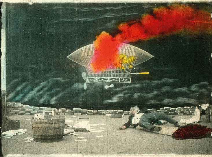
Because each hand-colored print had to be dyed separately, no two copies were colored in exactly the same way. In rare cases, colorists embellished entire scenes. More often, they painted only particular elements—a scarlet dress, golden coins, red-orange lava erupting from volcanoes, or fountains glittering in pinks, yellows, and golds. Mistakes were common. In one frame, dye might drip from a woman’s costume across an arm or a leg. In another frame, a yellow face might revert to black and white, or a brush stroke might slip outside its edges. Although each individual error was almost imperceptible when projected at around 18 frames per second, together they created ephemeral, almost iridescent flashes of color.
Stenciling
Hand coloring worked relatively well on shorter films, but as moving pictures grew in length and complexity, the method became unsustainable. To industrialize its output, Pathé Frères, a French production company, adapted a printmaking technique called pochoir for coloring films. Also known as stenciling, the process involves sponging ink through cutouts onto a surface below. Film stencils were initially hand cut from black-and-white prints, one for each color, with scalpels. However, the tiny 35mm frames made coloring imprecise, which caused edges to pulsate during projection and gave some viewers headaches.
Pathé sought mechanical means for bolstering accuracy and speed. In 1908, the company recruited technician Jean Méry, who had patented a stencil-cutting apparatus, which Pathé licensed. Méry’s device deployed a copying tool known as a pantograph, which connected the large movements of a wooden tracing stylus to the smaller movements of a stencil cutter. First, a projector magnified a film frame on a postcard-sized glass plate. Then a laborer used the stylus to carefully trace over portions of the enlarged image, thereby guiding the incisions of the slicer. With Méry’s machine, a skilled worker could cut only about 3 feet (or about three seconds) of footage per hour. But once the stencil was complete, it could be used to color multiple prints in rapid succession.

Pathé developed another machine for applying dyes to stenciled prints. One version comprised a large drum with sprocket teeth for aligning a stencil over a print. A worker turned a hand crank to move the print-stencil pair over the drum, putting it in contact with a coloring ribbon—a velvet loop that continuously ran through a dye tank. To ensure proper saturation levels, the setup could be adjusted to vary the amount of colorant passing from the ribbon through the stencil and onto the print.
Such technical refinements enabled Pathé and other producers to transform the style of their colored pictures. Like hand-colored works, early stenciled films typically fell in the trick and fairy genres. Their hues tended to be bright and saturated, functioning mainly as a special effect to wow spectators. But by the 1910s, narrative films, particularly melodramas and histories, were becoming the norm. With new stenciling technologies, filmmakers could print these works in precisely graded hues that tended toward pastels—purples, pinks, yellows, and light blues. Rather than create vibrant distractions, the subdued colors became part of a film’s mise-en-scène, playing into its settings and moods.
Tinting & Toning
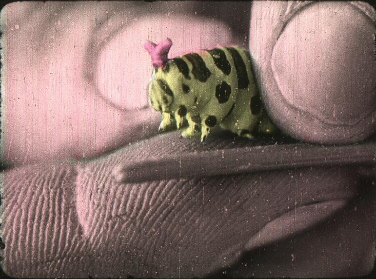
Tinting and toning were the most popular coloring techniques in early 20th-century cinema. To tint a scene, lab technicians immersed entire frames in vats of aniline dye, which seeped into the emulsion of the print, saturating anything that wasn’t black. The prints were then dried on racks before being edited into narrative order and wound back onto their reels. The process was inspired by colored translucent gels, known as tinters, which theater engineers used to overlay stage lights or magic lantern slides during performances, thereby washing the stage or screen in a single color.
Toning, on the other hand, was adapted from photography. It involved treating segments of a film with a series of chemicals that color only the darker parts of a frame. In photographs as well as film prints, traces of silver give black-and-white images their contours and density; the more silver in an image, the darker and more shadowy it appears. Toning converts or replaces this silver with tinted compounds, essentially turning blacks into sepias, blues, or greens while preserving a print’s original tonalities.
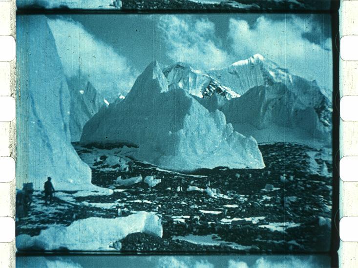
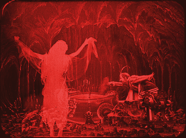
Both tinting and toning coded particular meanings. The messages could be explicit. For instance, the makers of silent films often used blue tints and tones for night scenes, reds for flames, and greens for nature. Other evocations were sensual, such as the icy cold of the blue-toned glaciers in Gekleurde kijkjes uit de geheele wereld (Glimpses in Color from the Whole World, Pathé Frères, 1913), or cultural, as in the diabolical aura of the red-tinted magician’s lair in Physique diabolique (Diabolical Physics, Pathé Frères, 1912).
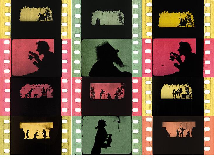
And in some cases, the coloring had no apparent logic at all. For example, in Jan Klaassen in de Hel1 (Jan Klaassen in Hell, MLK Film, 1915)—a Punch and Judy shadow play in which actors perform in silhouette—tints change frequently and in a seemingly random way. During the short plot, in which a hermit dreams of descending into the underworld to confer with the devil, scenes are variously tinted in greens, yellows, and pinks for no clear narrative purpose, suggesting a kaleidoscopic reverie.
Combining Techniques
Throughout the silent film era, producers often used several different coloring methods in tandem, orchestrating ever more sensational effects. Combinations of tinting and toning, for instance, created richly layered, two-color images. A spectacular example can be found in Alfred Machin’s L’âme des moulins (The Soul of the Mills, Pathé Frères, 1912). In the film, an angered vagabond sets a family’s windmill afire under the cover of night. As he approaches the windmill, silhouetted against it, the scene is toned blue to signify darkness and tinted pink, perhaps to convey dusk or to reinforce the ominous mood. When he lights the fire, billowing smoke erupts in saturated pink. The film then cuts to a fiery red-tinted inferno, heightening the emotional shock.

Perhaps the most elaborate illustration of this kind of hybrid coloring is Alfred Machin’s pacifist feature Maudite soit la guerre (War Be Damned, Belge Cinéma Film, 1914). The plot centers around two best friends from warring countries, Adolphe and Sigismond, who die fighting one another. When the two armies face off in the countryside, the scene is mostly tinted light blue and toned brown, with stenciled green grass, to depict an otherwise bucolic and clear sunny day. But as soldiers and cavalry battle amidst cannon fire and aerial bombs, the tinting flashes blood red in one- to six-frame increments.

Another dramatic use of color occurs when Sigismond’s comrades ignite a bomb beneath a yellow-stenciled windmill, toppling it and killing Adolphe, who is cornered inside. At the explosion, the formerly blue and brown coloring cuts to a scarlet tint. When soldiers rush over to inspect the damage, the frames gradually transition to purple and finally back to their original pastoral hues—a slow clearing of the air. The film’s colorists achieved this effect by adjusting the amount of colorant in a tinting bath as the filmstrip passed through.
Such technical proficiency was remarkable for its time. By the end of the 1920s, print coloring fell out of fashion with the introduction of sound and was largely replaced, first by photographic color film and more recently by digital codes. But in mastering their craft, Thuillier and other colorists of the early 1900s gave films a dynamism no one had seen before, inaugurating a new culture of color from which we never turned back.
Joshua Yumibe is an associate professor and the director of film studies at Michigan State University.
This essay is adapted from “The Techniques of the Fantastic,” by Joshua Yumibe, in Fantasia of Color in Early Cinema Copyright @ 2015 (EYE Filmmuseum/Amsterdam University Press).
References
1. Noverre, M. “Le gala Méliès,” Le nouvel art cinématographique 5: 2nd series (1930). Translated by author.
2. Raff, N.C. & Gammon, F.R. “The Vitascope” (brochure, 1896). In Musser, C. (Ed.) Motion Picture Catalogs by American Producers and Distributors, 1894–1908: A Microfilm Edition University Publications of America, Frederick, MD (1984–1985).
The lead image is a still from Dirigeable fantastique, 1906, from the collection of EYE Filmmuseum.


