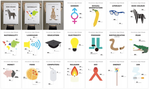
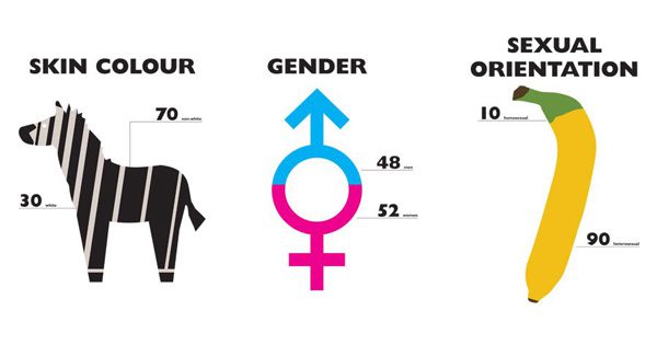
From data visualization to infographics, we’re big on the power of smart graphic design to convey big concepts that are otherwise hard to grasp in their raw numberness. Which is why we love designer Toby Ng‘s poster series The World of 100 — an experimental graphical representation of statistical information about the world, based on the allegorical scenario of reducing the world to a village of 100 people.

The series is pure design crispness — simple vectors make the shapes clean enough to make their point, with vibrant, solid colors making those points all the more visceral and impactful.
In a weird way, we were the most shocked by the least consequential ones, our daily entitlements that we take for granted — somehow, PSA’s and the general sense of social responsibility have made most of us aware of severe problems like hunger, deadly disease, and the lack of clean drinking water. But computers? Not something we’d given much thought to, and yet:
We wish we could show you the actual posters — some of the web images are too small to read the text, which is a pity as the information is nothing short of humbling. For instance, in our proverbial village of 100:
48 can’t speak, act according to their faith and conscience due to harassment, imprisonment, torture or death.
And some of it, although common knowledge, makes some of our societal ironies particularly salient. Like the notion of “minorities” — in public policy, in employment recruiting, in education quotas. It’s never been this evident that the ratios of power are not contingent upon the ratios of numbers.
Check out all 20 posters here. And enjoy that computer of yours — the other 93 villagers can’t.


