As an illustrator, I often struggle to decide how far I should push the boundaries of creativity. I’ve noticed that there is a fine line between art that is accessible to my peers and art that is accessible to everyone. And I don’t always know where to draw that line.
In a Nautilus post, Jim Davies describes how “processing fluency”—how easily we understand something—predicts aesthetic appreciation. Experts often appreciate more complex innovations because they are constantly surrounding themselves with similar ideas. So while I might find a complicated design beautiful, other people might just find it confusing.
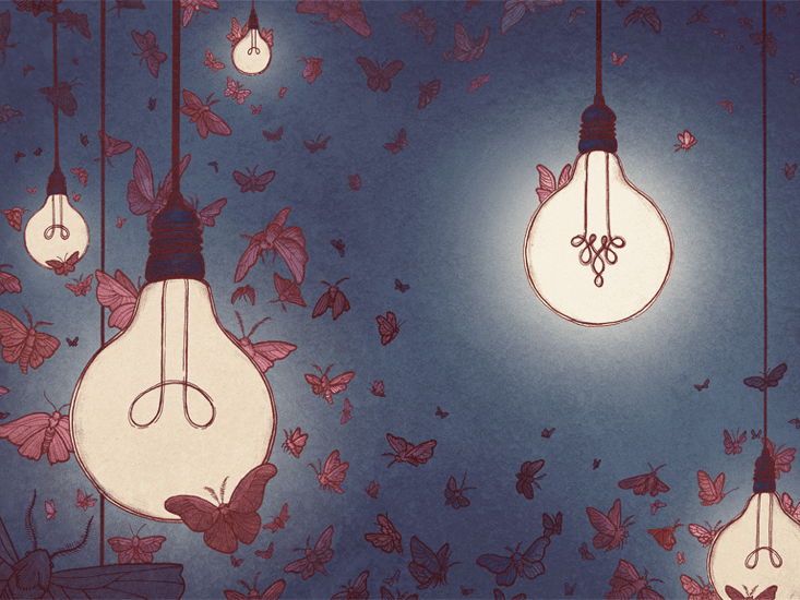
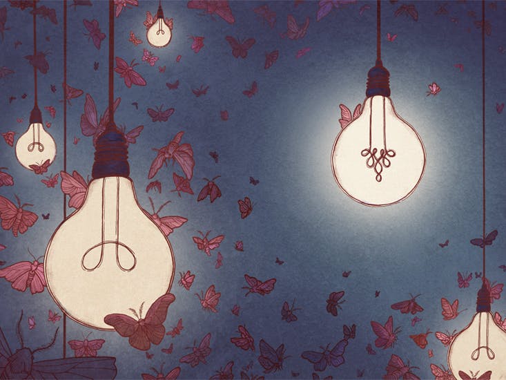
I wanted to use a visual metaphor to convey the idea behind Davies’ story. The whole process behind this illustration for me was very eye opening because I experienced first-hand the dilemma that Davies describes.
My initial sketches for this illustration, involving mazes, were overly complex. As I worked and reworked them, it became obvious that over-complication didn’t necessarily make it better. Instead, it became harder to understand.
Then I thought about how moths are drawn to light bulbs in the same way people are attracted to new things. What would happen if one of the bulbs suddenly got weird? Most moths might avoid it. But a few, like me, might still stick around.
So I stripped the piece of its extra layers of imagery and symbolism to make way for a more subtle metaphorical approach, which worked better in my eyes. At least in my case, less was more.

Christina Chung is an illustrator in Brooklyn, New York, and a graduate of the Pratt Institute.


