 Last fall, mere months before iconic typeface and logotype designer Doyald Young passed away, Lynda.com produced a wonderful short documentary about him, in which Young tells his incredible rags-to-proverbial-riches story and reveals the principles behind his timeless, unique letterforms and logos. Besides being a design legend, he was also an epitome of the intellectual ideal of curiosity as powerful tool of creative growth.
I did not finish high school, I didn’t even complete the tenth grade, and throughout my whole life, I’ve read extensively — it’s how I’ve educated myself.”
I think the reason that I have been attracted to lettering and typography is because, in one sense, so little of it has changed — the letters that we look at today are the same letters that we looked at 500 years ago. And I sort of like the stability of it and I think it all goes back to the fact that my dad moved us around all the time, my whole childhood was in a state of flux. So I look for stability, and typography gives me that stability.”
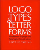
Nearly two decades after its original publication, Young’s Logotypes & Letterforms: Handlettered Logotypes and Typographic Considerations remains a timeless classic and a fine addition to the 10 essential books on typography — a big thanks to reader Donald Lais for the great call.


