Whether you’re a professional designer, recreational type-nerd, or casual lover of the fine letterform, typography is one of design’s most delightful frontiers, an odd medley of timeless traditions and timely evolution in the face of technological progress. Today, we turn to 10 essential books on typography, ranging from the practical to the philosophical to the plain pretty.
 TYPOGRAPHIE (1967)
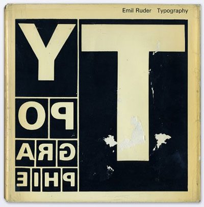
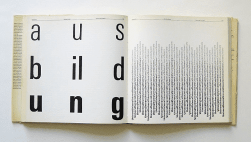
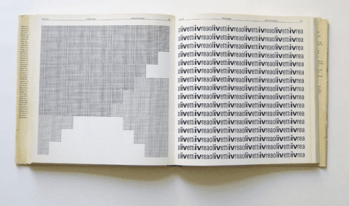
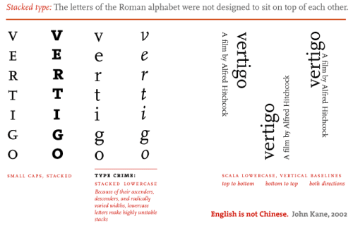
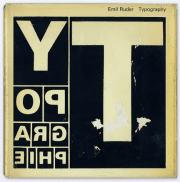 In 1967, iconic typography pioneer Emil Ruder penned Typographie: A Manual of Design — a bold deviation from the conventions of his discipline and a visionary guide to the rules of his new typography. From texture to weight to color to legibility spacing and leading, the 19 chapters gloriously illustrated in black-and-white with some in red, yellow and blue explore insights from the author’s studies and experiments. More than half a century later, the book, now in its sixth edition, remains a timeless bastion of typographic innovation across generations and eras.
Images via Display
 CULTURAL CONNECTIVES (2011)
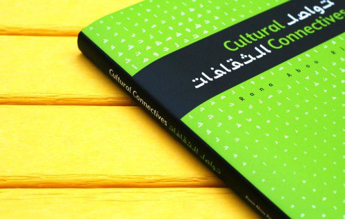
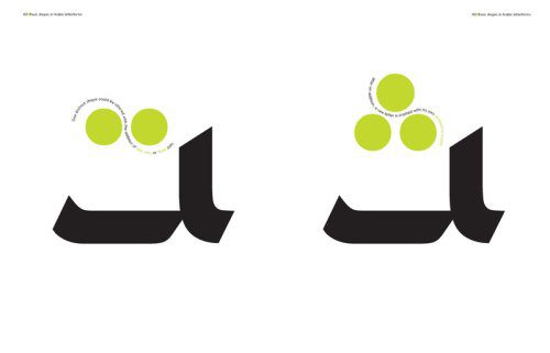
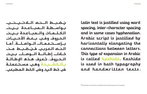
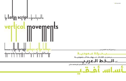
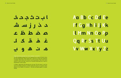
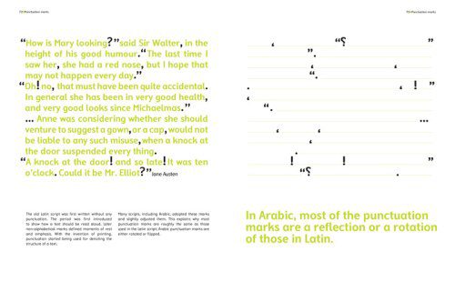
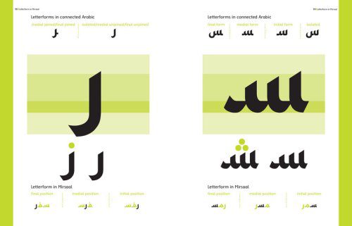
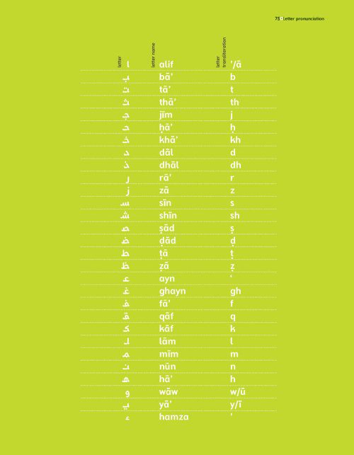
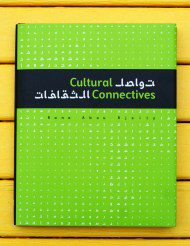 In an age when we frequently encounter the Middle East in the course of our daily media diets, our true knowledge of the region remains impoverished amidst these often limited, one-note and reductionist portrayals. We know precious little about Arab culture, with all its rich and layered multiplicity, and even less about its language. Cultural Connectives tries to remedy this with a cross-cultural bridge by way of a typeface family designed by author Rana Abou Rjeily that brings the Arabic and Latin alphabets together and, in the process, fosters a new understanding of Arab culture. Both minimalist and illuminating, the book’s stunning pages map the rules of Arabic writing, grammar and pronunciation to English, using this typographic harmony as the vehicle for better understanding this ancient culture from a Western standpoint.
The book jacket unfolds into a beautiful poster of a timeless quote by Gibran Khalil Gibran, rendered in Arabic:
We shall never understand one another until we reduce the language to seven words.” ~ Gibran Khalil Gibran
Our full review, with more images, here.
 THE ELEMENTS OF TYPOGRAPHIC STYLE (1992)
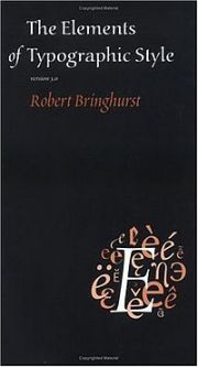 In 1992, Canadian typographer, poet and translator Robert Bringhurst set out to create “the Typographer’s Bible.” And he did — two decades later, his The Elements of Typographic Style prevails as the most ambitious history of and guide to typography. TypeFoundry‘s Jonathan Hoefler and Tobias Frere-Jones have called it “the finest book ever written about typography.” Covering everything from rhythm and proportion to harmony and counterpoint to analphabetic symbols, the tome remains a brilliant convergence of the practical, theoretical and historical. Sprinkled across the pragmatic guides are compelling, almost philosophical insights about the role of typography in communication, visual culture and society, making the volume as much a handbook as it is a meditation.
 THINKING WITH TYPE (2007)
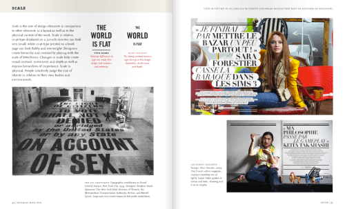
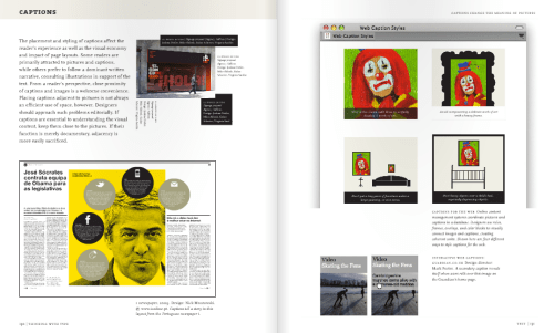
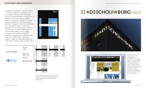
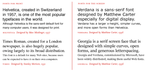
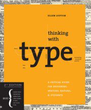 The use of typography in visual communication is evolving rapidly, and often radically, as we shift from print culture to screen culture, and at the same time certain foundations of typographic creativity and visual eloquence remain fundamental. That’s exactly what Ellen Lupton explores in the 2010 revised and expanded edition of the now-classic Thinking with Type: A Critical Guide for Designers, Writers, Editors, & Students, originally published in 2007 by Princeton Architectural Press. From the latest style sheets for print and the web to the essentials on mixing typefaces and hand lettering, the book is a visually-driven blueprint to typographic style and originality by way of knowing the rules in order to break them creatively.
The book’s excellent companion site features a wealth of materials and resources for designers, students and educators alike.
 I WONDER (2010)
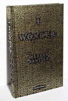 Marian Bantjes, whose magnificent map of human knowledge you might recall, is no ordinary creator. Trained as a graphic designer, with a decade-long career as a typesetter under her belt and a penchant for the intricate beauty of letterform illustrations, she calls herself a “graphic artist” and is an avid advocate for self-education and self-reinvention. Stefan Sagmeister has called her “one of the most innovative typographers working today” — with no exaggeration. (So innovative, in fact, that P. Diddy recently felt compelled to shamelessly, blatantly rip her off.) I Wonder capture Bantjes’ exceptional talent for visual delight and conceptual fascination, intersecting logic, beauty and quirk in a breathtaking yet organic way.
I exist somewhat outside of the mainstream of design thinking. Where others might look at measurable results, I tend to be interested in more ethereal qualities like does it bring joy? is there a sense of wonder? and does it invoke curiosity?”
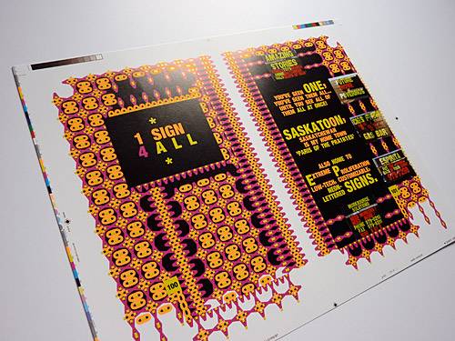
I’m using my own writings as a kind of testing ground for a book that has an interdependency between word and image as a kind of seductive force. I think that one of the things that religions got right was the use of visual wonder to deliver a message. I think this true marriage of art and information is woefully underused in adult literature. And I’m mystified as to why visual wealth is not more commonly used to enhance intellectual wealth.”
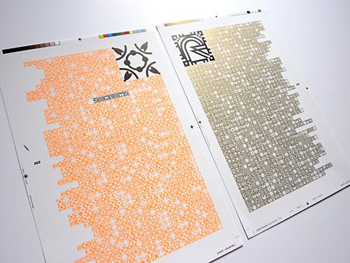
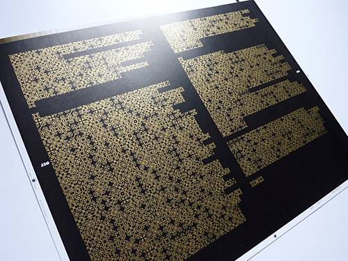
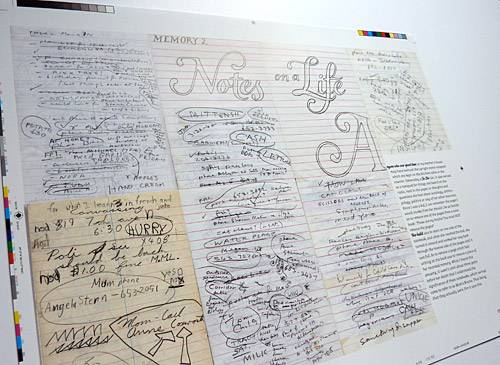
Our full review, complete with Bantjes’ excellent TED talk, here.
 JUST MY TYPE (2011)
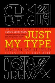 Just My Type: A Book About Fonts by Simon Garfield, published in the UK in 2010 and dropping the U.S. on September 1 this year, is a genre-bender of a typography book — part history textbook, part design manual, part subtle stand-up comedy routine. From the font that helped pave Obama’s way into the White House to the “T” of the Beatles logo, Garfield dances across 560 years of typographic history, sprinkled with fascinating anecdotes and vignettes, to infect you with his own inability to walk past a sign without identifying the typeface and some curious factoid about it. Funny and fascinating, irreverent and playful yet endlessly illuminating, the book is an absolute treat for the type-nerd, design history geek and general lover of intelligent writing with humor.
Did I love this book? My daughter’s middle name is Bodoni. Enough said.” ~ Maira Kalman
 AN ESSAY ON TYPOGRAPHY (1931)
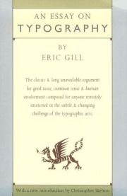 When Eric Gill wrote An Essay on Typography in 1931, he probably didn’t anticipate it would live on to become not only the most influential manifesto on typography’s cultural place ever written, but also a timeless reflection of art and man in industrial society. He later described his chief objective to “describe two worlds that of industrialism and that of the human workman & to define their limits.” Gill himself was a Renaissance man — a sculptor, engraver, illustrator, and essayist — known for his successful Gills Sans and Perpetua typefaces, and he designed the typeface Joanna to hand-set the book. He was also a creature of dichotomies — a deeply religious man who produced a number of erotic engravings.
While the book has been out of print and fairly hard to find for a number of years, you can get your hands on a used copy with some sifting around the web or your local (design-savvy) bookstore.
Letters are things, not pictures of things.” ~ Eric Gill
 SCRIPTS (2011)
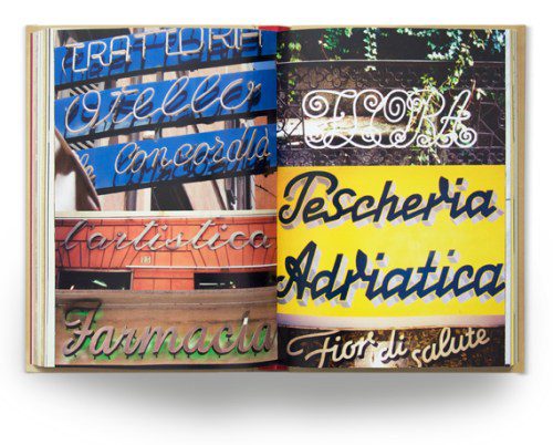
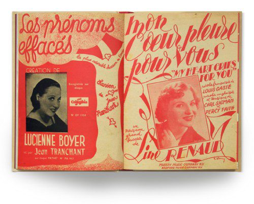
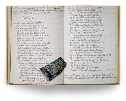
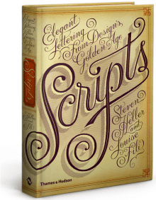 From iconic design writer Steven Heller (previously: I II III) and a fascinating look at the design and branding of dictatorships and acclaimed designer Louise Fili comes Scripts: Elegant Lettering from Design’s Golden Age — a treasure chest of typographic gems culled from advertising, street signage, type-specimen books, wedding invitations, restaurant menus and personal letters from the 19th to the mid-20th century. Ranging from the classic to the quirky, the 350 stunning images are unified by a common thread: All the typefaces featured are derived from handwriting or symbolic of the handwritten form, and the letters in each touch each other. And in a day and age when pundits are lamenting the death of handwriting as a much deeper cultural death, there’s a special kind of magic about the celebration of beautiful scripts.
Our full review here.
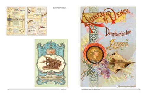
 TYPE (2009)
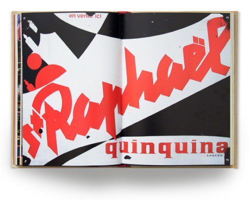
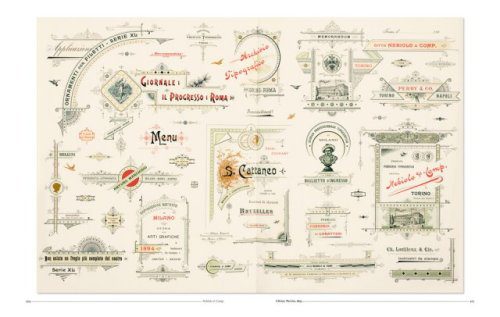
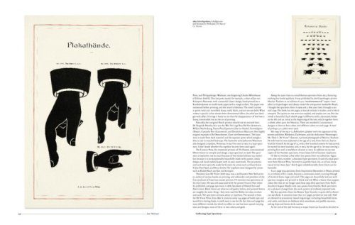
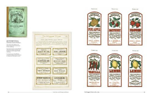
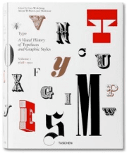 Type: A Visual History of Typefaces and Graphic Styles, Vol. 1, from lavish-book-purveyor Taschen, explores the most beautiful and remarkable examples of font catalogs from the history of publishing, with a sharp focus on the golden age of color catalogs, the period from the mid-19th century to the mid-20th century. Culled from a Dutch collection, the book’s magnificent and vibrant type specimens — roman, italic, bold, semi-bold, narrow, and broad — are complemented with a thoughtful look at ornaments, borders and other type-adornments. Victorian fonts, with all their richness and complexity, are a central fixation. The book comes with exclusive access to Taschen’s online image library, featuring over 1000 high-resolution scans of type specimens downloadable for unrestricted use.
 THE 3D TYPE BOOK (2011)
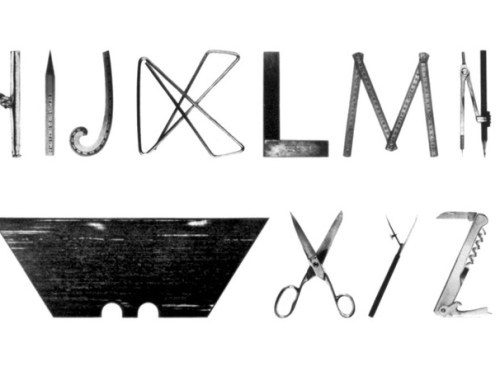
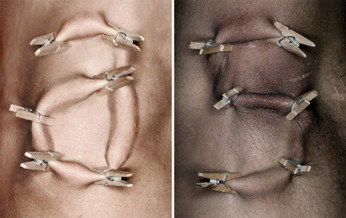
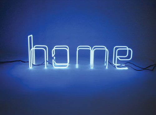
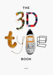 From London-based design studio FL@33 comes The 3D Type Book, dubbed “the most comprehensive showcase of three-dimensional letterforms ever written.” With more than 1,300 images by over 160 emerging artists and iconic designers alike, it spans an incredible spectrum of eras, styles and mediums. From icons like Milton Glaser and Alvin Lustig to contemporary Brain Pickings favorites like Stefan Sagmeister, Marian Bantjes, Ji Lee, Stefan G. Bucher and Marion Bataille, it’s a treasure trove of typographic treasures.
From toothpaste typography to sperm alphabet to typonoodles, the book’s typographic specimens both make us see with new eyes the seemingly mundane building blocks of language and reconsider ordinary objects, materials and media as extraordinary conduits of self-expression.
Our full review, complete with an a video preview and more images, here.


