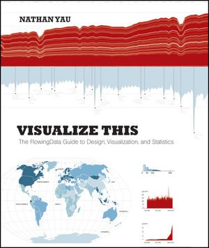
 Data visualization is a frequent fixation around here and, just recently, we looked at 7 essential books that explore the discipline’s capacity for creative storytelling. Today, a highly anticipated new book joins their ranks — Visualize This: The FlowingData Guide to Design, Visualization, and Statistics, penned by Nathan Yau of the fantastic FlowingData blog. (Which also makes this a fine addition to our running list of blog-turned-book success stories.) Yu offers a practical guide to creating data graphics that mean something, that captivate and illuminate and tell stories of what matters — a pinnacle of the discipline’s sensemaking potential in a world of ever-increasing information overload.
And in a culture of equally increasing infographics overload, where we are constantly bombarded with mediocre graphics that lack context and provide little actionable insight, Yau makes a special point of separating the signal from the noise and equipping you with the tools to not only create better data graphics but also be a more educated consumer and critic of the discipline.
From asking the right questions to exploring data through the visual metaphors that make the most sense to seeing data in new ways and gleaning from it the stories that beg to be told, the book offers a brilliant blueprint to practical eloquence in this emerging visual language.
On the book’s companion site, you can find downloadable data files, interactive examples of how visualization works and, if you’re technically inclined, even code samples to use as the basis for your own visual experimentation.
Visually stimulating, intellectually illuminating and creatively compelling, Visualize This: The FlowingData Guide to Design, Visualization, and Statistics is equal parts practical vocabulary for an essential modern language and conceptual testament to the power of data visualization as a new form of journalism and a powerful storytelling medium.
For a historical perspective on infographics, be sure to see the story of Otto Neurath’s Isotype.


