In 1931, Harry Beck designed the first diagramatic map of the London Underground. By 1960, the Tube Map had evolved into the icon of minimalist modern design that we know and love today — a meme, even. And as any meme, it has spawned a number of creative derivatives. Here are five such tube-map-inspired gems.
 MILKY WAY TRANSIT AUTHORITY
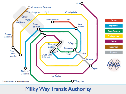
A dreadfully long subway commute can often send you scrambling for ways to bend the space-time continuum. Now, one scientist has done just that — sort of. Samuel Arbesman, a Harvard postdoctoral fellow in computational sociology, has created The Milky Way Transit Authority — a brilliantly simplified map of the Milky Way displaying the complex interconnections of our galaxy in a digestible way.
Beyond the clever visualization concept, we love the fusion of science and philosophy in Arbesman approach:
People ask why I haven’t marked ‘You Are Here’ on the map – but I think it’s more humbling to realize that we aren’t the center of the universe.” ~ Samuel Arbesman
We also find it fascinating to think of the incredible and daunting vastness of the universe in such mundane terms — there’s something eerily soothing about this hop-hop-there-it-is approach to the celestial expanse.
 GOING UNDERGROUND
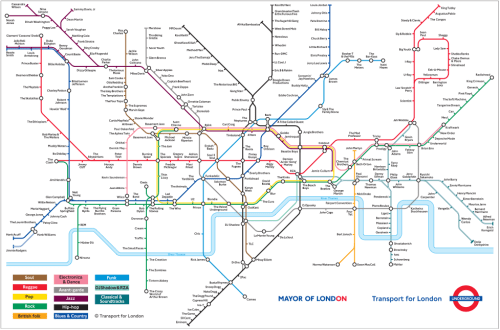
In 2006, the ambitious folks at The Guardian‘s Culture Vulture blog set out to plot the branches and connections of 100 years of music on a London-Tube-style map. From Ray Charles to Radiohead, the project is an impressive feat of musicology and cultural history.
Each line represents a different genre, with the influential musicians in it as the stops.
We strongly encourage you to explore this priceless and fascinating blueprint to 20th-century music culture — grab a high-res PDF here.
 KABBALAH TREE OF LIFE
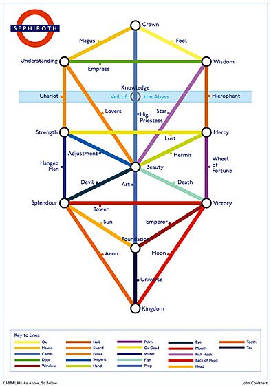
Making sense of religious doctrine can get messy and confusing. This tube-style map of the Kabbalah Tree of Life, first spotted in Alan Moore’s comic book series Promethea, attempts to shed light on the Sephiroth — the ten attributes of God in the Kabbalah.
Despite the seeming simplicity of the map, it plays on many of the Kabbalah’s sacred numbers and relationships. The three columns, for instance, arrange the ten sepiroth according to the three pillars — the Pillar of Mildness, the Pillar of Mercy, and the Pillar of Severity. And the twenty-two lines connecting the sephiroth reflect the number of letters in the Hebrew alphabet.
To make things even more elaborate, adding the 10 sepiroth and 22 lines together makes 32, the number of Masonic degrees and the number of Kabbalistic paths to wisdom.
 SOMERSET TOURS
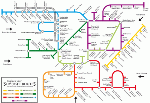
I’m a big believers in using the familiar as a metaphor that introduces and piques interest in the unfamiliar. And the folks at the Somerset Tourism Bureau in the UK tend to agree — so they created this wonderful Heritage Touring Map based on the London Tube Map, featuring seven thoughtfully curated “lines” of tourist attractions and must-sees.
Already a clear box-breaking thinker in tourism communication, the Somerset office even has its very own Vimeo channel, including seven short films, one about each tour “line”.
 WEB TREND MAP
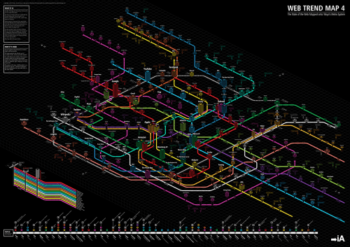
Every year, Japanese-Swiss design studio Information Architects maps the web’s biggest influencers, subway-style. The project’s latest installment, Web Trend Map 4, is an absolute masterpiece of design, data visualization, and digital anthropology — which, in fact, has enjoyed a level of viralness deeming it worthy of being on the map itself.
Sure, WTM may be based on the Tokyo Metro Map, but that was actually built borrowing heavily from the London Tube Map, so it’s just a matter of degrees of creative separation.
BONUS
I’ve featured it before, to a great response, so it’s worth mentioning the MBTI Personality Map and its psychosocial genius.
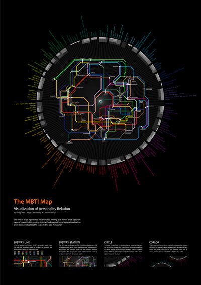
Each subway line represents one of the 16 Myers-Briggs personality types, arranged based on the semantic distance between the 39 core word descriptors. The outer circle contains the 161 original word descriptors from the MDS test, grouped into 8 layers based on hierarchical order. Finally, the colors of the words intuitively represent their meaning — so “calm” is in the blue spectrum and “passionate” in the red.
Information design for the social sciences — now that’s something to encourage more of.


